May 12, 2008
Top reasons your CSS columns are messed up
I believe the recent surge in popularity of CSS frameworks comes from a lack of basic understanding of the CSS box model and how it’s implemented across browsers. I wanted to share with you some quick tips on how to avoid easy pitfalls so you can create your own CSS framework in no time flat, without all the cruft of having ten thousand column combinations available. Keeping these quick tips in mind at all times will allow you to do something I like to call defensive coding – and really that’s all CSS frameworks are: defensively coded snippets of CSS.
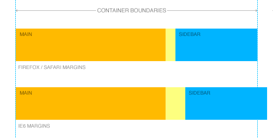
Your margins are doubled in IE6

Here’s a super common pitfall: IE6 will double margins facing the direction of the float. Example problematic code:
.sidebar{
  float:left;
  margin-left:20px;
}
This sidebar will have a 40px left margin in IE6 – almost certainly throwing the sidebar down below the content, and not next to the content as it should be. Easy fix: add display:inline; No side effects in any browser, and IE6 obeys margins perfectly.
.sidebar{
  float:left;
  margin-left:20px;
  display:inline
}
Why it works: By declaring float on an element, you implicitly demand that it must be rendered as a block element – thus rendering the display:inline inert. However, due to IE6’s awesome CSS engine, it fixes a bizarre bug that is the #2 reason I see CSS columns fail in IE6.
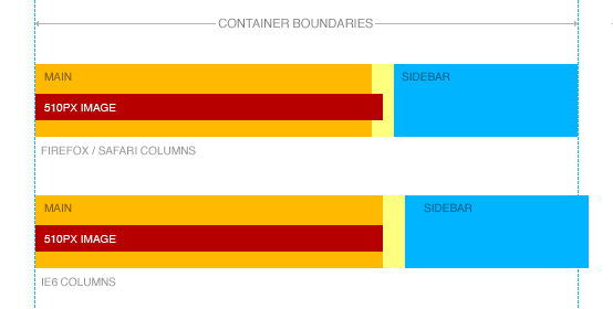
Your content is wider than your column

Let’s pretend you’ve got this simplistic setup of code:
.columns{
  width:500px;
}
.columns .main{
  float:left;
  width:400px;
}
.columns .sidebar{
  float:right;
  width:100px;
}
HTML:
<html>
...
<div class="columns">
  <div class="main">
    <img src="/images/awesome.gif" />
  </div><!-- /.main -->
  <div class="sidebar">
    <p>Sidebar rules!</p>
  </div><!-- /.sidbear -->
</div><!-- /.columns -->
...
</html>
Harmless right? You might view this in Firefox and everything will be fine. But then you look at it in IE6 and your sidebar has mysteriously dissapeared below .main. WTF? You look at the HTML, the CSS, and everything’s fine. What could possibly be wrong? A common problem here is if awesome.gif is 510px wide. What this does is push out .main to 510px, and suddenly there’s not enough room for .sidebar inside .columns any longer. Ack!
Easy fix: add overflow:hidden to your columns. This forces the width restriction to crop any extruding content. New magical CSS:
.columns{
  width:500px;
}
.columns .main{
  float:left;
  width:400px;
  overflow:hidden;
}
.columns .sidebar{
  float:right
  width:100px;
  overflow:hidden;
}
Your margins extend past your container

So you’re building out a simple product listing template out, and you throw it in an unordered list:
ul.listing{
  margin:0;
  width:400px;
}
ul.listing li{
  list-style-type:none;
  float:left;
  margin:0 20px 0 0;
  width:85px;
}
HTML:
<html>
...
<ul class="listing">
  <li>Product #1</li>
  <li>Product #2</li>
  <li>Product #3</li>
  <li>Product #4</li>
</ul>
...
</html>
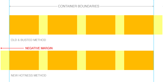
This CSS will work just fine in something like Firefox, but for mysterious reasons you’ll see that Product #4 appears on it’s own line in IE6. What’s happening here? I mean 4 columns x 85px + 3 gaps x 20px = 400px, right? Except that your 4th gap is hanging over the right edge – pushing the true width of the blocks to 420px. Firefox is smart and lets that margin just hang out there – but IE6 will apply that margin within the parent wrapper – throwing the 4th item down since it takes up 20px more than it should have.
The fix? Apply a left margin to each item, with a negative margin to the wrapper. This means that every item has a visible margin, but the whole block of elements are yanked back by the negative margin:
ul.listing{
  margin:0 0 0 -20px;
  width:420px;
}
ul.listing li{
  list-style-type:none;
  float:left;
  margin:0 0 0 20px;
  width:85px;
}
This gets around the nasty solution of adding a class to the first or last item in every row – something I’ve seen with abundance around the web.
Building a CSS framework in no time
Wev’e got to start out with some basic HTML. Here’s what I’ve been using lately:
<html>
...
<div class="columns col2">
  <div class="column first">
    ...
  </div><!-- /.first -->
  <div class="column last">
    ...
  </div><!-- /.last -->
</div><!-- /.columns -->
...
</html>
For different column widths, I’ve been changing out the col2 declaration to things like col2A, col2B, col2C and so on. You could easily give them more semantic names like products-columns too.
Self clearing is the future
The first step for any column framework is self-clearing. It’s easy, practical, and reduces all those damn clearing divs.
.columns:after {
    content: ".";
    display: block;
    height: 0;
    clear: both;
    visibility: hidden;
}
* html .columns {height: 1%;}
.columns{ display:inline-block; }
.columns{ display:block; }
Float those columns
Next step is to actually float those columns. So let’s add a couple more declarations:
.columns .column{
  float:left;
  overflow:hidden;
  display:inline;
}
.columns .last{ float:right; }

.col2 .first{ width:500px; }
.col2 .last{ width:100px; }

.col2A .first{ width:400px; }
.col2B .last{ width:200px; }

.col3 .first{ width:100px; }
.col3 .second{ width:280px; margin-left:20px; }
.col3 .last{ width:200px; }
Done… uh, what?
Oh, yeah. That’s it. That’s all it takes to create reliable columns in CSS. Really.
Here’s an example page to prove it!
If you'd like to keep in touch, I tweet @kneath on Twitter. You're also welcome to send a polite email to kyle@warpspire.com. I don't always get the chance to respond, but email is always the best way to get in touch.