June 28, 2011
Designing GitHub for Mac
A few days ago we lifted the curtains on a project I’ve been deep into for a long time now: GitHub for Mac. This is the first OS X app I’ve designed and thought it might be interesting to share some of the process and things I learned throughout development.
Why should we build it?
For a long time I assumed OS X developers would see the immense market for an awesome Git application. Unfortunately for everyone involved, every OS X application that’s showed up over the years gave up and tried to turn CLI commands into buttons.

Clients claiming to be “simple” choose to redefine “simple” as fewer supported Git commands rather than simplifying the interaction with Git.
It blows my mind that no one tried to do anything special. Git (and its DVCS cousins like Mercurial & Bazaar) provide an amazing platform to build next generation clients — and it’s like the entire OS X ecosystem left their imagination at home.
Eventually, I (well, many of us) decided that better native clients (OSX, Windows, Linux, Eclipse, Visual Studio, etc) was the best way to grow GitHub. And since we all use Macs — we should start off with an OS X application. Build what you know/use, expand from there.
What are we building?
Personally, I had some big goals:
-
Death of the SSH key. People should be able to connect to GitHub with their GitHub username and password.
-
Make it obvious that there is a distinction between remote and local. Make it clear what commits need to be pushed before others can see them.
-
Simplify the
git fetch, pull (--rebase), pushinteraction. Synchronize — don’t make the user figure out what they need to do to get their local commits remote and remote commits local. -
Fix the local/remote branching problem. Get rid of this tracking idea — interact with local or remote branches as if they were no distinction between the two.
I didn’t want to replace the command line. I wanted to build an awesome version control client. As it happens, Git is the perfect backend to do that — and GitHub is the perfect central server to collaborate.
Sketches & early ideas
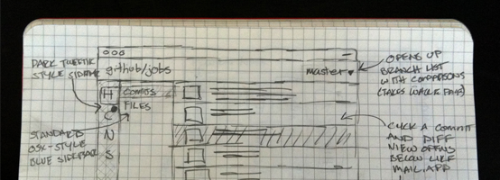
The first thing we did was to start populating an internal wiki full of ideas. Lots of words, lots of sketches.
Let’s get some designers on this
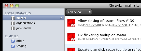
I’d been using OS X for years, but I didn’t feel comfortable designing a native app. My previous attempts at OS X design weren’t too fantastic…
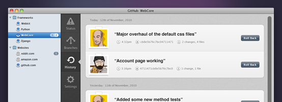
In the end, we hired Eddie Wilson to come up with some wireframes and some comps while Joe and Josh cranked away at the Cocoa backend. His first comps were a great start, and influenced the end product tremendously.
Unfortunately right about this time is when we learned how much we suck at working with contractors. We’re extremely opinionated, really bad at expressing our opinions, and change our minds all the time. We asked Eddie to hold off while we re-grouped and figured out what we wanted from the app.
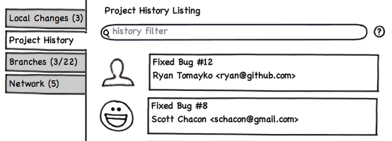
We sat down and had a lot of discussions about how we wanted this thing to work. Brandon Walkin helped out quite a bit, and even sketched up some wireframes & notes for us.
Eventually we figured out what we wanted to design — but now we didn’t have anyone to design it. Eddie had since taken up other work and pretty much every Cocoa designer on the planet was inundated with work.
In the end, I decided that GitHub for Mac was the thing I wanted out of GitHub, and if I wanted it to happen I’d have to take the design reins. I picked up Eddie’s comps and ran with it.
A slow process
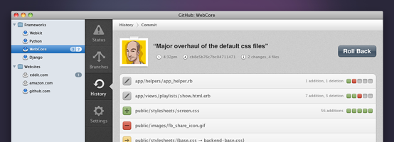
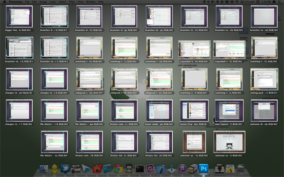
I tried my best to combine Eddie’s original comps with our internal feedback and match it up with a modern OS X look & feel. All in all I created 45 comps for 1.0 — each with about 5-10 unique states (with layer groups).
After the first round of comps, I started writing down how I imagined everything to work.
My plan was to fully flesh out this styleguide — but as it happened, Josh was able to implement my designs faster than I could explain them. Still, I think it was a good exercise to explain my thinking for the designs — if anything for my own personal benefit.
The aesthetic
Learning the OS X aesthetic wasn’t easy. And it probably didn’t help that I started to get serious about OS X design about the same time Lion screenshots started showing up. Like it or not, OS X app design is changing in drastic ways right now.
 </a>
</a>
Scrollbars are a thing of the past. Titlebars full of clickable areas. Buttons shedding themselves of borders. Custom graphics / buttons for every app. And Helvetica everywhere!
I tried my best to weigh this new direction with a lot of my favorite designed apps — Twitter, Espresso, Sparrow, and Transmit to name a few.
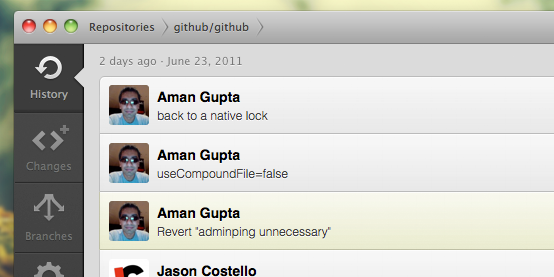 Tweetie style side-tabs. No title in the window, instead a breadcrumb — always promoting a one-window experience.
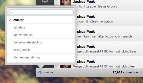 We use a lot of popovers (borrowed from iOS / XCode) rather than modal windows throughout the app.
 Subtle buttons in the title bar.
Lessons learned
Designing a native OS X app was definitely full of surprises. I’ve actually done quite a bit of native development before with WPF & Flex — but Cocoa is quite different.
Welcome to 2004 — everything is a sliced image
Remember web development in 2004? When you had to create pixel-perfect comps because every element on screen was an image? That’s what developing for Cocoa is. Drawing in code is slow and painful. Images are easier to work with and result in more performant code.
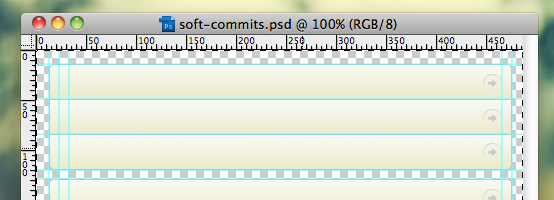 Remember these days?
This meant my Photoshop files had to be a lot more fleshed out than I’ve been accustomed to in recent years. I usually get about 80% complete in Photoshop (using tons of screenshotting & layer flattening), then jump into code and tweak to completion. But with Cocoa, I ended up fleshing out that last 20% in Photoshop.
Change is painful
Want to move an element from the bottom of the screen to the top? A lot of times with Cocoa this involves rewriting your entire view. There is no layout engine for Cocoa. If you want two elements to rest side to side, you’ll need to calculate the pixel size of the text, padding, borders, margins — then manually position the next element.
 What about Interface Builder? Pretty useless. Everything is a blue box on complex projects.
Want to change the background color of a button? You’re probably going to have to rewrite all of the drawing code for the button. There is no styling engine in Cocoa.
This sucks. And it means that change is insanely painful in code. It’s much easier to prototype with HTML / CSS and see if the design is going to hold up.
This proposed changes redesign is a good example of what I mean. I spent a long time creating a “clickable” prototype with animations. In the end, we decided a lot of the core ideas were wrong and decided not to go down that path. Creating this HTML/CSS/JS prototype took a couple days. Doing the same in code would have taken a lot longer — and been much harder to throw away (due to the way project files work in Xcode, branching is not simple).
Objective-C is easy, Cocoa is hard
This was the first serious Cocoa project I’ve been involved with. I had dozens of little example projects, but never pushed through to ship anything. As I went on and talked to people about my frustrations, they inevitably came up with the same response:
Why don’t you just use MacRuby?
Why? Because Objective-C is really easy. The language was never a problem. You know what was? Cocoa. Learning the differences between layer-backed views, layer-hosted views — understanding that you have to subclass everything — balancing delegates, weak connections, strong connections, KVC, view controllers, and notifications — understanding little intricacies like how AppKit flips .xibs when it load them up or how hard it is to make one word in a sentence bold. I’m not going to lie: Cocoa (that is: AppKit, UIKit, Core Text, Core Animation, etc) is extremely difficult. The gap between simple example apps and a fully functional application is huge.
Projects like Chameleon that give you a purely layer-backed environment to work with using a modern API (UIKit) matter far more than the language you’re using. This isn’t to say MacRuby isn’t awesome — it just means that it doesn’t make AppKit development any easier; you still have to learn Cocoa.
Along those same lines, I think that Cocoa is dying for a framework. Something that weighs on the simple defaults side rather than complex code generation side.
Secrecy is overrated
GitHub for Mac was in development for just under a year and there was never any leaked screenshots or blog posts. In fact, there were dozens of public screenshots of the app on dribbble — but for the most part, people were surprised when we launched.
We didn’t have beta testers sign NDAs or demand first-borns to get access to the early builds. How on earth did we keep something under wraps for so long?
We asked people politely not to share it with the world. It’s really not that hard. Don’t send betas to douchebags. Politely ask people not to blog about it. Done.
Here’s to a bright future
I’m hoping that GitHub for Mac (and supporting projects, like libgit2) spurs a new round of creativity in source control clients. I’ve already seen some progress — like legit — but I’m hoping to see a new generation of source control clients in the future. Git is immensely powerful, and it’s up to us to leverage that power into something awesome.
If you'd like to keep in touch, I tweet @kneath on Twitter. You're also welcome to send a polite email to kyle@warpspire.com. I don't always get the chance to respond, but email is always the best way to get in touch.
